
Feb 2
UX: Wife failed the test on horizontal overflow scroll
It looks clean as it is, but I worry some users won't know how to scroll left or right, especially on a Mac trackpad and Magic Mouse. I tested it on my wife and she no idea.
In Progress
Makes sense to me! Sure it's not as pretty, but UX is more important I think ☺️
Yeah agree. Will do my best to make it pretty and functional!
Added the ability to hide the logo inside the chat!
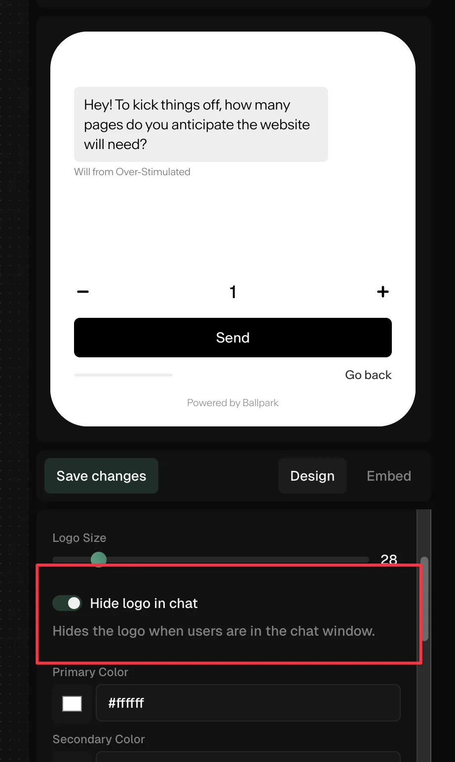
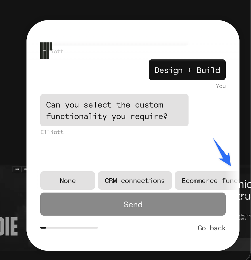
Awesome thank you! Yes I agree. I think we need a better way to show of the available options. Will share some mock ups of ideas in here soon. I'll add an option to hide the logo in the widget customisation settings. I think this would be sick. Stay tuned!
I have the same concern. I tested on a my wife who is non-technical, and she had no idea what to do (https://ballpark.userjot.com/board/p/ux-wife-failed-the-test…).
Thank you for the feedback! Moving this one to priority number 1 as it's now been mentioned a few times now. I'm thinking we stack the options on top of each other inside the chat so that users can scroll naturally to see all. This is a very rough example but fits the typical chat option UX.